.png)

by Rachel Lyon, Editorial Director for The House Designers
If plain schemes aren’t for you, kick your design up a notch by adding contrast with stone or brick! Choosing a palette that sets off other colors in the space is one thing, but have you looked at how different products and applications can stand out on their own? Here’s how you can amp up your design with contrasting stone and brick details!

Move the Eye with Color Contrast
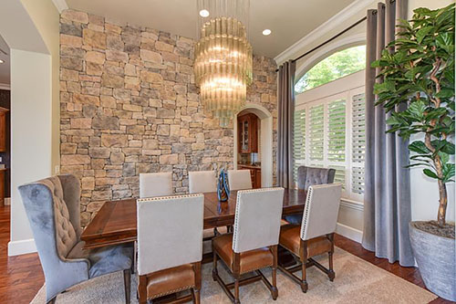
When you look at stone and brick veneer products, you’ll find they come in a huge range of different looks. Some are uniform in shape and/or color while others are comprised of much more diverse pieces. Variety draws the eye and adds dimension, so most people prefer to have at least some color variation to keep their designs from looking too stark or falling flat.
Veneer products are available in multiple color blends ranging from very subtle to bold, and they can be monochromatic or multi-hued. You’ll find tons of options if you like greyscale or shades of brown or tan, of course, but some combine warm and cool hues for an even more dynamic effect. Remember that the amount of contrast needed to stand out varies based on the overall tone; you only need a touch of color to attract attention against a primarily white base, but more deeply colored pieces will be needed the darker the base is. Subtle contrast incorporates beautifully into most designs—don’t think you need to take it to extremes to make an impact!
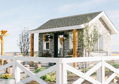
Your stone and brick elements will form the background of your design, so look at the big picture and consider your other furnishings. Offset your furniture and accents with a blend of complementary colors, or let them pop against a similar color with a much different depth of tone. If you can’t find the kind of contrast you want in a single product, you may be able to mix and match, so look at all the options and consult with a professional to make sure your idea will work.

Make It Pop with Contrasting Grout
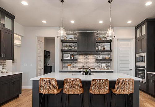
The stone or brick you choose is just the first step—you can completely change the look with how you install it! Many people choose complementary grout or a dry-stack stone application that doesn’t let it show through, but if you want to highlight the shape(s) of the stone or the pattern laid, a contrasting grout color will serve you well. Grout can be purchased in a range of colors or mixed on-site for a custom solution, so it’s the easiest and most effective way to make any stone or brick stand out.
You’ll see this method employed with brick often, because the straight, square edges naturally create a geometric pattern. Just define it with contrasting grout and you’ve got a simple yet chic background element to break up the room! You can do the same with stone veneer with similar effect if the pieces fit together neatly, but be aware that rougher and rounder shapes will show grout unevenly, which could look messy if you draw attention to it. Additionally, it’s best to employ contrasting grout when the stone itself features only one color or very limited variation, because it’s difficult to effectively contrast a range of hues in a single application. So, take your pick—grout color or stone color blend—for a balanced look.

Take Account of Shadows for Contrast
Don’t overlook the effect of lighting! You won’t see much of a difference with flat-faced veneer profiles including brick and large, blocky stone, but there are all sorts of shapes that catch and block light to produce a mottled effect over the surface. These highlights and shadows will affect the colors you see whether you’ve chosen a single- or multi-hued product!
Contours that break up the monotony of the wall might be all you need for subtle contrast. Faceted silhouettes that jut outward sharply and pieces that install at varying depths will further define each color. Depending on the type and angle of the light, the same profile and color blend could look completely different—this is why interior and exterior applications rarely look the same. Make sure to factor this into your stone selection if you want a particular effect in or on your home.
No matter the kind of stone or brick you need to create the perfect aesthetic, Eldorado Stone has you covered. Their collection runs the gamut with products in all shapes, sizes, and colors. If you have any trouble deciding what you need to meet your design goals, try their concierge design services to get an expert opinion!